 Button
The Button object is an object with four distinct states: Default, Hover, Pressed and Disabled. In the Novelty editor buttons can be hooked up to perform some action. You can customize the look of each button state to make it look more interactive, but you don't have to. Button is a versatile object type that can adapt to various visual styles.
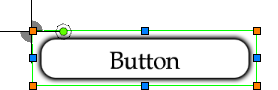
Fig: Button object
Usage
Example use cases:
- Interactive front end
- Triggers for running scripts, changing pages, etc.
Caveats
Visual components (such as Borders, Images) of a Button will be automatically sized to fill the button's rectangle unless a specific size is set.
The first text object within a button state is considered to be the caption. Their text-values will be overridden with the caption-value of the button.
Related articles
Sample NoveltyML
<!-- Button with all four states defined -->
<Button name="My button">
	<Default>
		<Image texture="My texture" />
		<Text font="My font" text="Default" />
	</Default>
	<Hover>
		<Image texture="My texture" />
		<Text font="My font" text="Hover" />
	</Hover>
	<Pressed>
		<Image texture="My texture" />
		<Text font="My font" text="Pressed" />
	</Pressed>
	<Disabled>
		<Image texture="My texture" />
		<Text font="My font" text="Disabled" />
	</Disabled>
</Button>